


今からはるか昔の80年代にはネオンカラーを用いた、当時の感覚では近未来的なイメージだったネオンカラーデザインが多用されていました。
その頃、未来を感じさせるデザインは強い魅力があり、主にパープル色、オレンジ色が含まれているのが特徴的でした
具体的なデザインでいうと
ダークカラーの背景に鮮明なロゴタイプでフォントはゴシック系などのくっきり太いものというイメージが
80年代のレトロなネオンスタイル的ではないでしょうか。
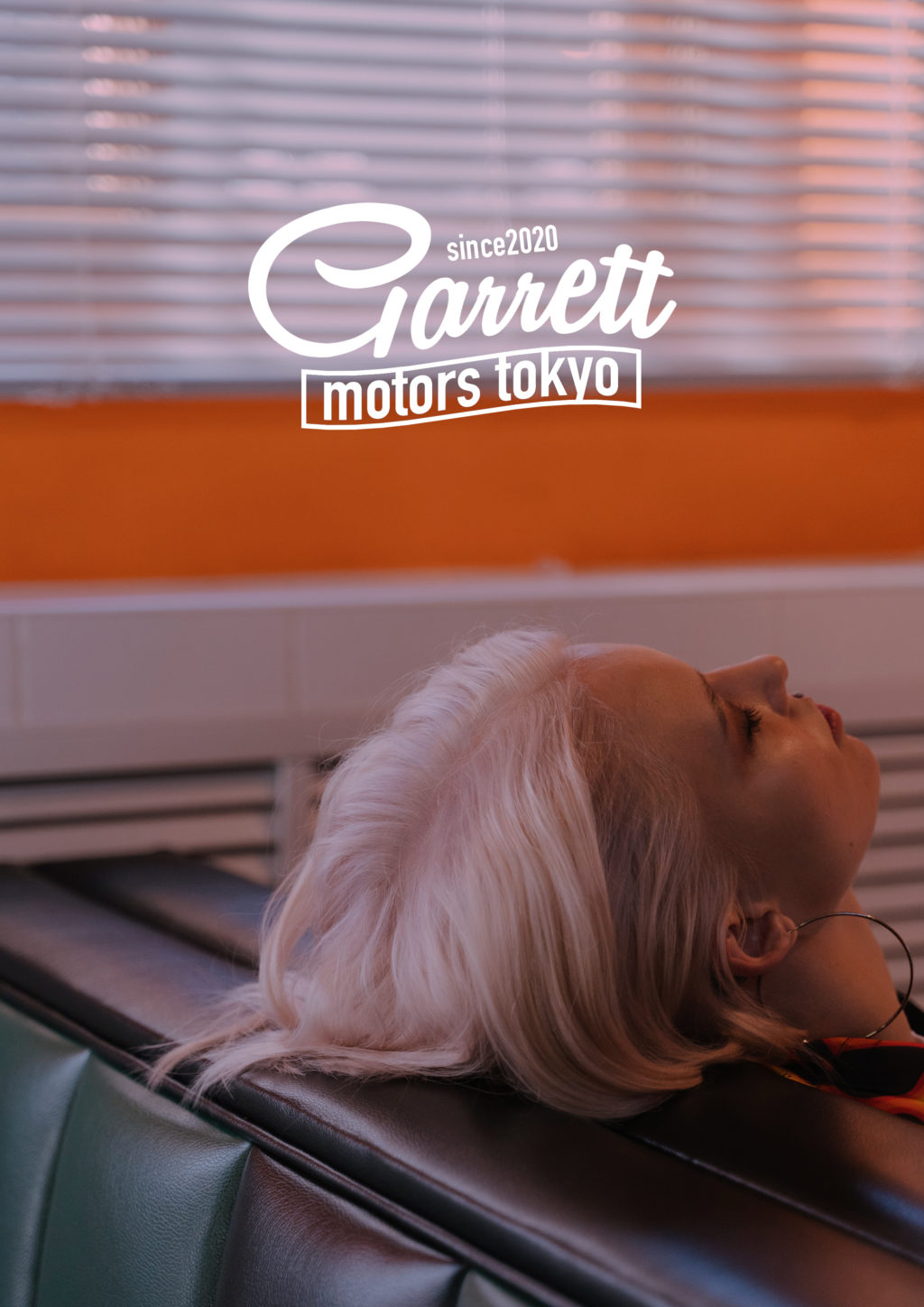
今回はそんな80年代レトロなネオンイメージでTシャツに使えるロゴデザインを考えて見ることにしました
Contents
80年代風ネオンデザインは紫青系のダークなグラデーション使いがキモ
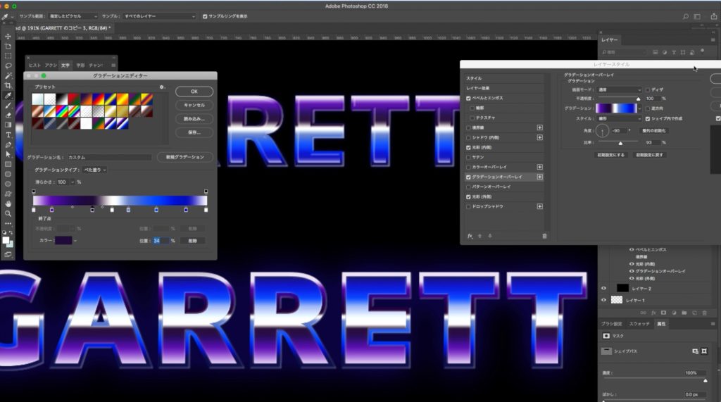
ネオンデザインの雰囲気を出すにはグラデーションの使い方がキモになります。暗めで紫が入ったグラーデーションを上手く使いながらロゴを作っていきます
フォトショップを使った80年代ネオン風なロゴデザインの作り方
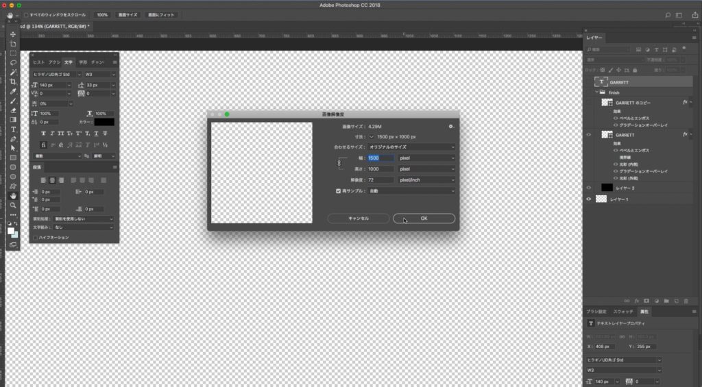
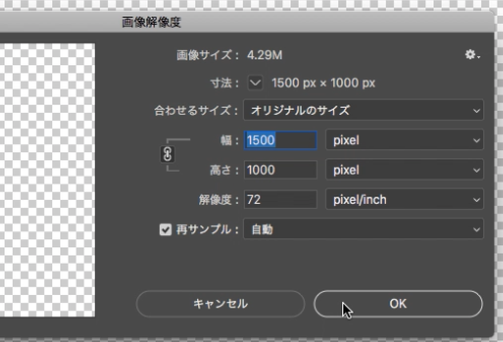
最初に新規ファイルを作ります
ファイル→新規ファイル
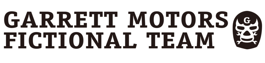
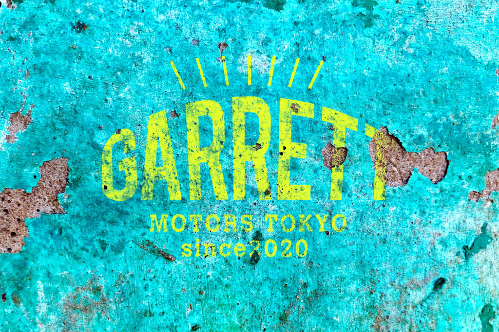
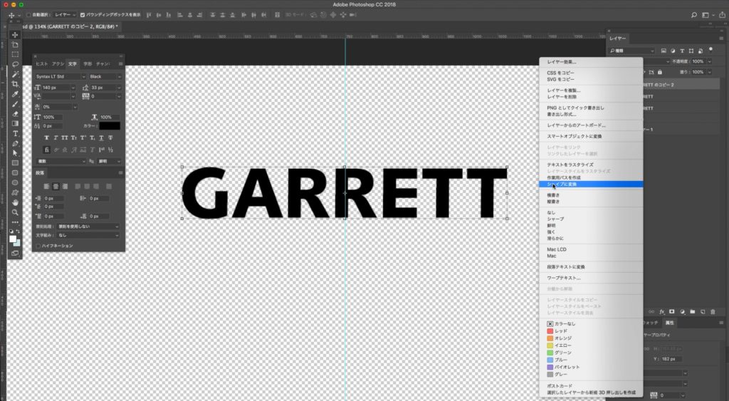
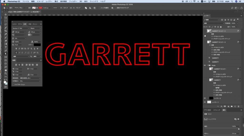
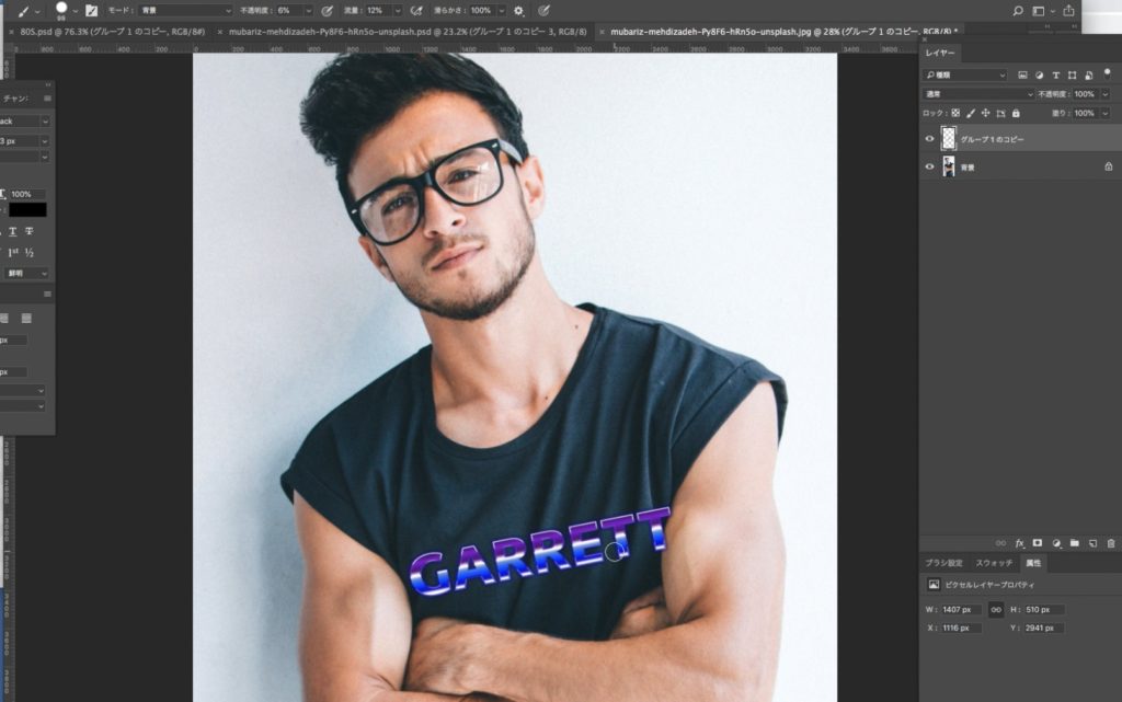
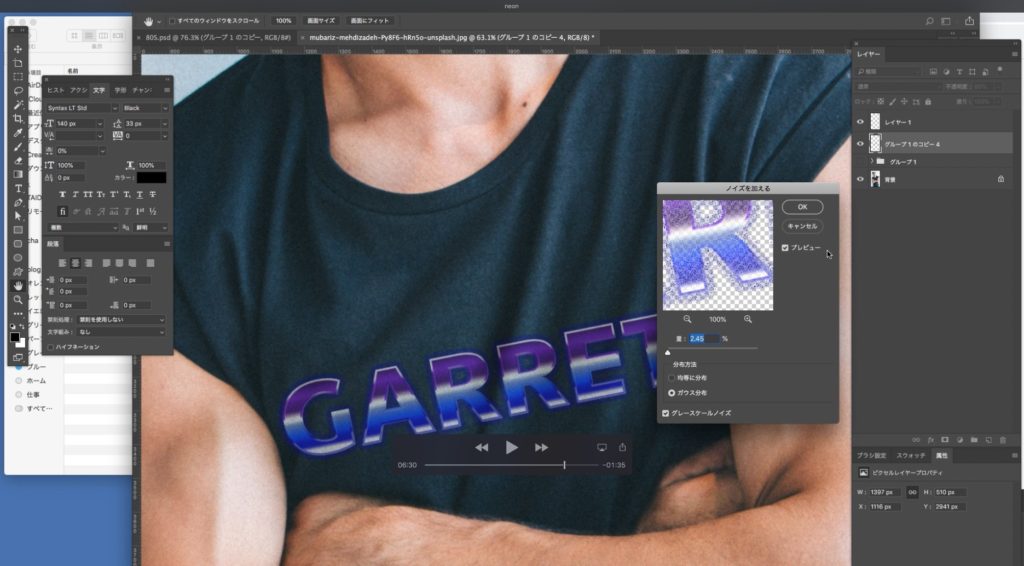
GARRETTの文字をSyntax LT Std Blackを使用。
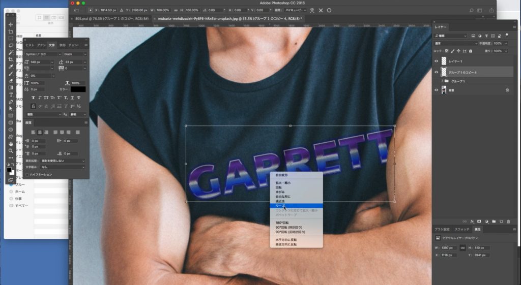
文字をシェイプに変換します
ここではシェイプに変換することで塗りや線の変更がやりやすくなります
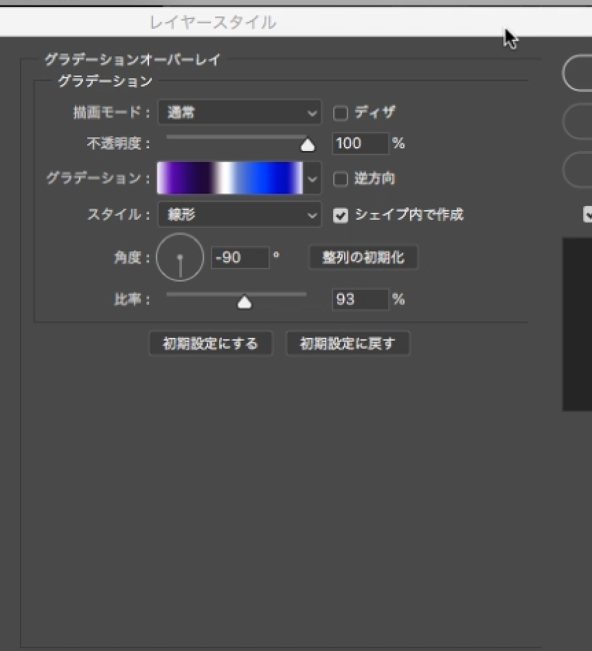
レイヤースタイル→グラデーションオーバーレイ
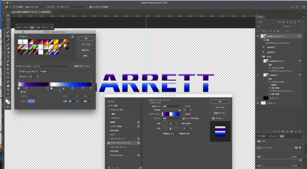
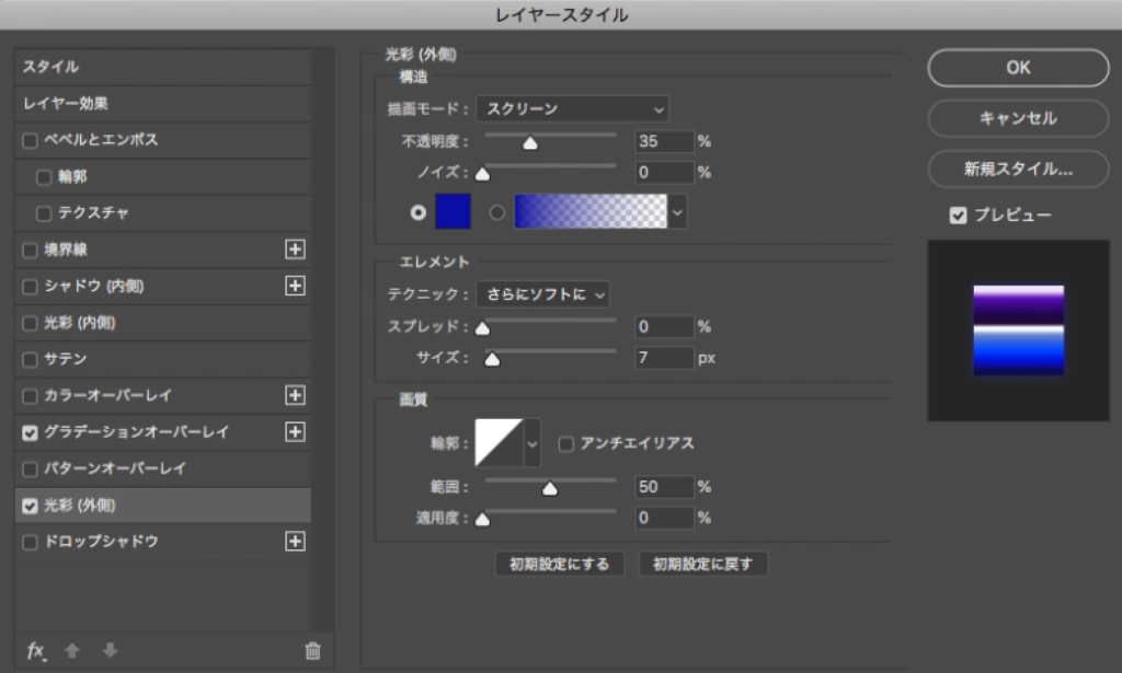
レイヤースタイル→光彩(外側)
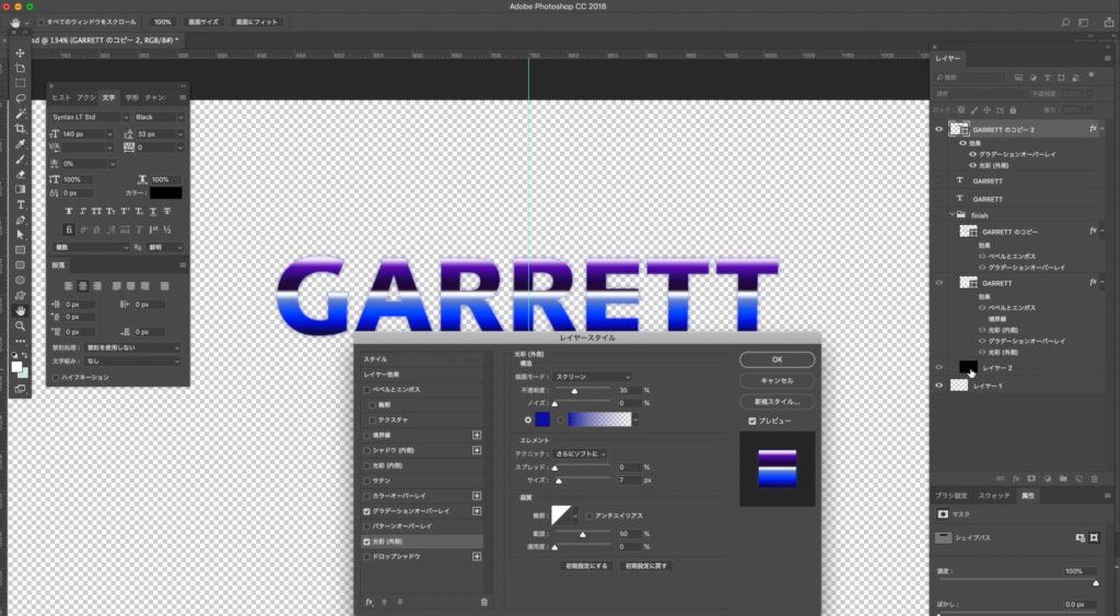
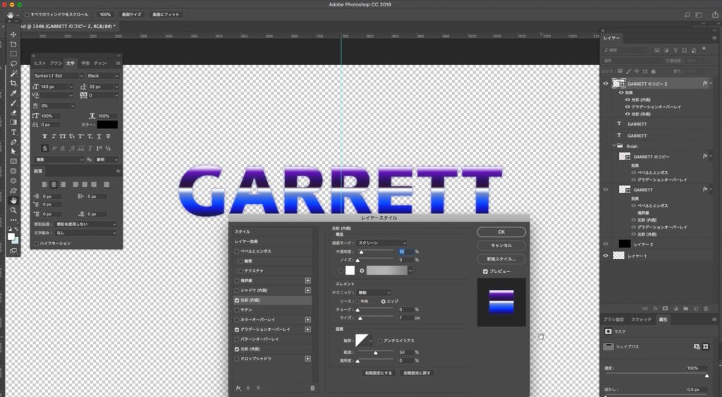
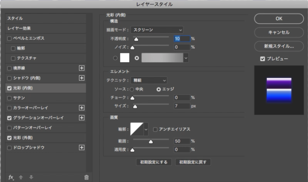
レイヤースタイル→光彩(内側)
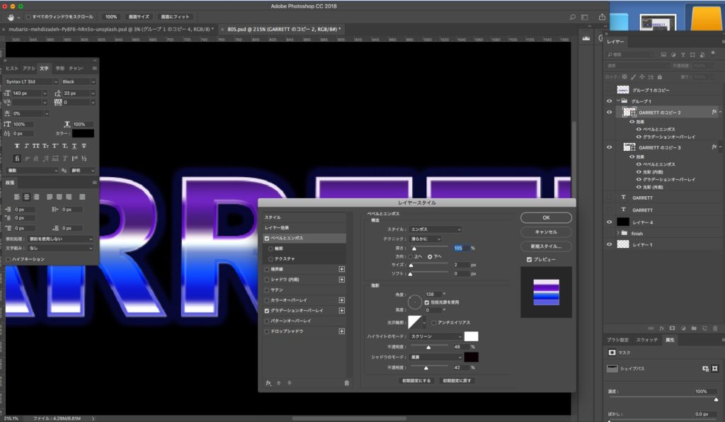
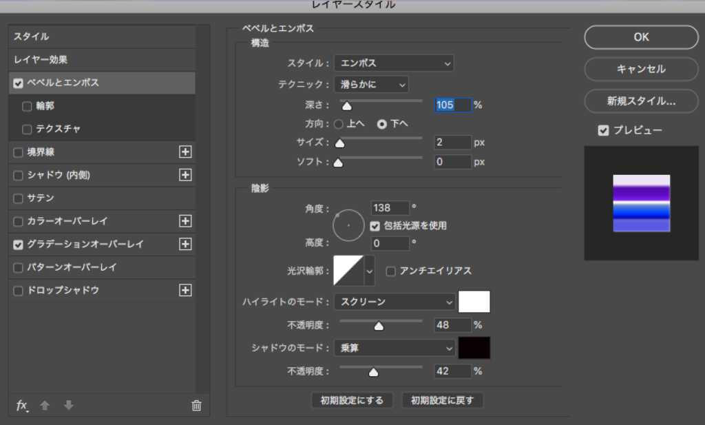
レイヤースタイル→ベベルとエンボス
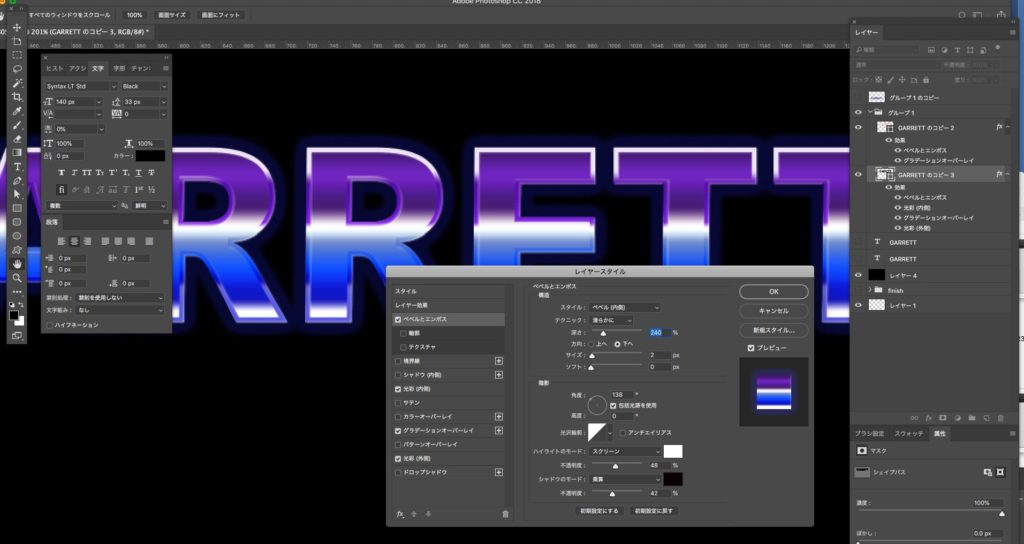
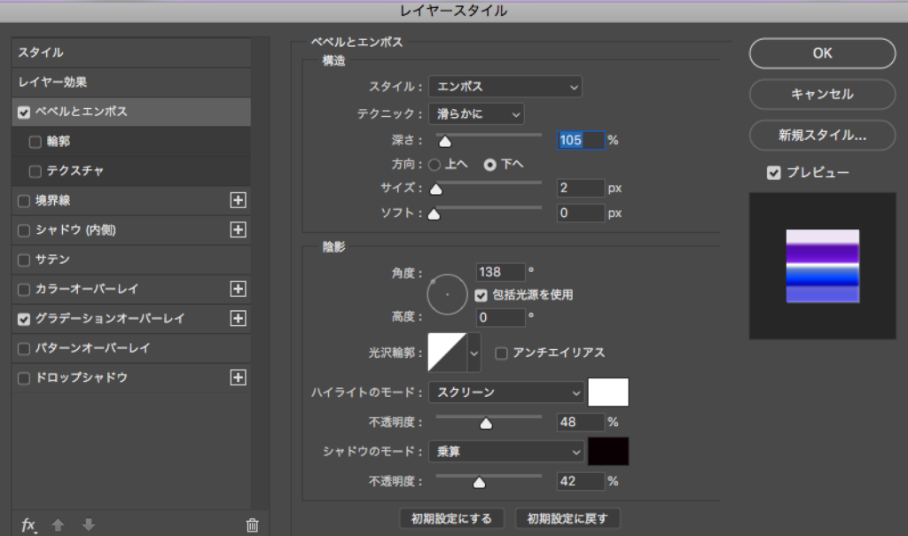
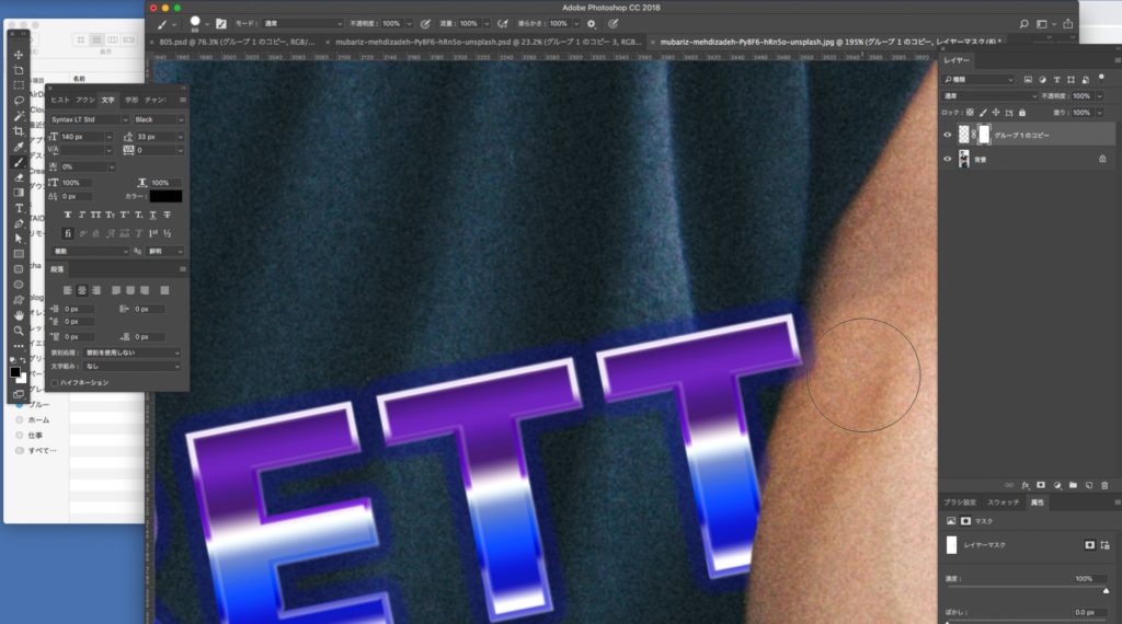
フチをつけて立体感と光彩をアップさせます
文字をシェイプに変換したものコピーして、塗りはなし、線幅5pxにします
レイヤースタイル→グラデーションオーバーレイ
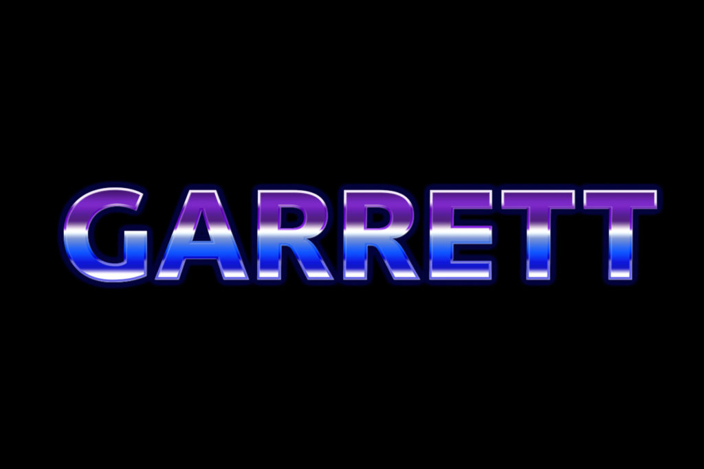
フチにエンボスをかけて立体感を追加すれば完成です
レトロ感と近未来感が程よく混ざった80年代風ネオンロゴができました
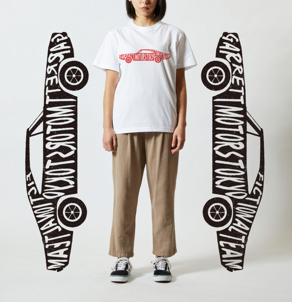
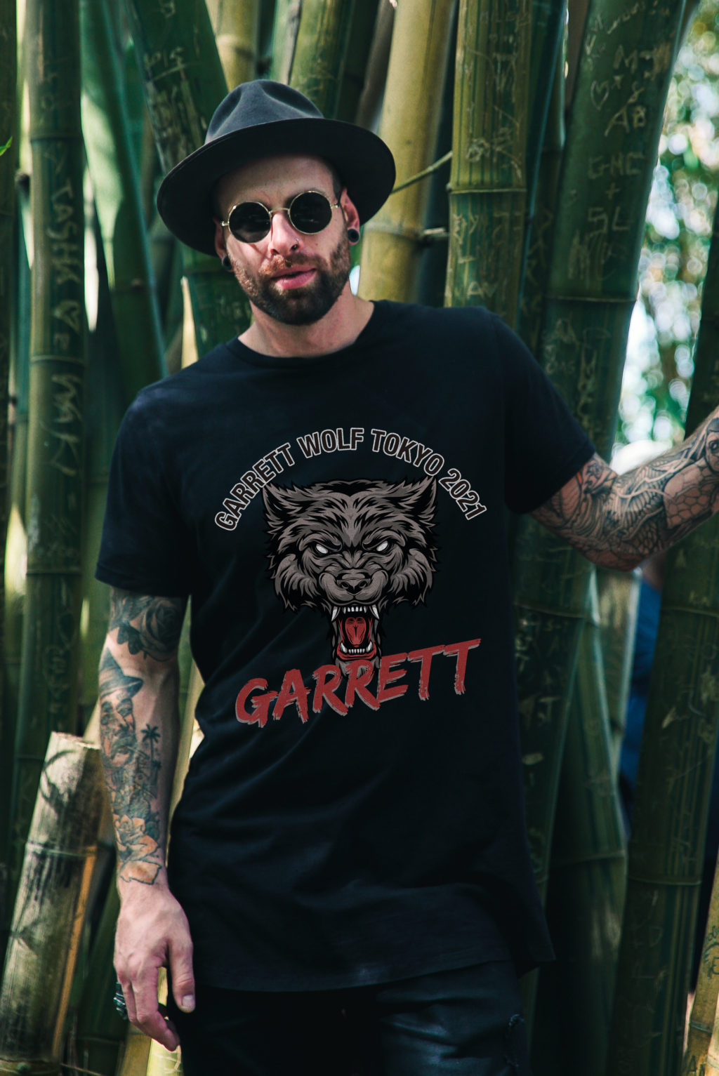
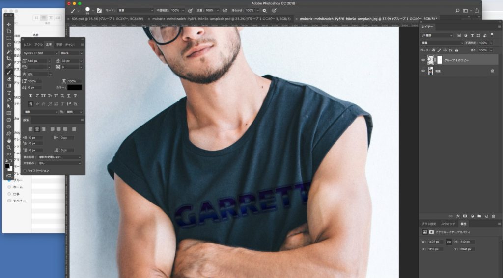
作ったロゴをTシャツデザインに展開
つくったロゴをTシャツに入れてTシャツとして完成させます
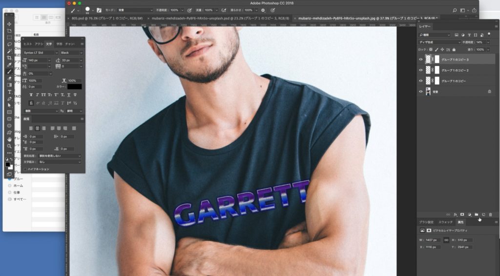
Tシャツに合成していきます
最初のレイヤー(最下層)は乗算30%
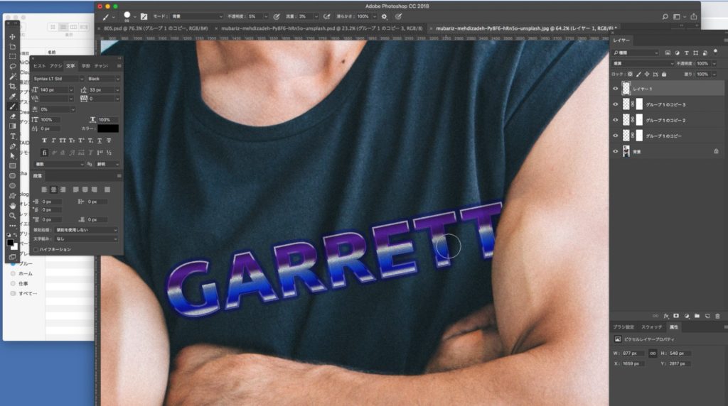
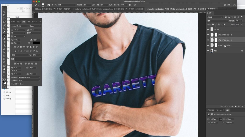

Tシャツイメージが完成
着古した感じのTシャツにあわせて色褪せた雰囲気でロゴを合成してトーンを合わせました

80年代のネオンイメージは古い映画やアニメで見たわけではなく、ゲームか何かで見ました。ネオン管が80年代というイメージは個人的にはなかったのですが、調べて見ると暗めの紫グラデーションがちょうど良いレトロ感と80年代的近未来感なのだと感じたので今回のイメージを作ってみました。数字で見ると難しそうですが実際につくってみると割と簡単でした。昔の映画などを参考にまた作ってみようと思います!